(Photo: HeForShe)
1. Not Everyone Loves HeForShe. In several of my posts – my slacktivism post, my pronouns post.. – I recalled a few groups and people who are a bit more critical of the campaign. From the name of the campaign itself, to the specific calls to action it makes, people have problems with HeForShe. Like I have mentioned previously, I think this type of criticism is inevitable with such a hot topic issue. Every one is entitled to their opinion, and that doesn’t mean that HeForShe is bad or in any way not necessary. So that brings me to my next takeaway…
2. A Lot of People Love HeForShe. Although some people have problems with certain aspects of the campaign, others sing its praises. I went into this more in depth in a previous post, but now more than ever, many believe that we need HeForShe. It is a groundbreaking campaign, and it addresses many persistent issues in society today. I spoke about this in my modern misconceptions post, and noted how Emma Watson directly addresses false notions of feminism. I think it is about time someone takes a stand on this issue, so that misguided groups like Women Against Feminism are more informed about the true meaning of feminism and gender equality.
(Photo: HeForShe)
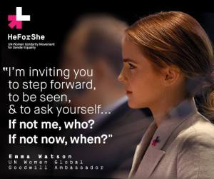
3. People Also Love Emma Watson. Speaking of Watson, people are largely fans of the actress and have positive sentiments toward her. This touches on the power of celebrity that I mentioned in my “what if?” post, and how Watson’s positive reputation combined with her many accomplishments – film roles and a degree from Brown University – have won many people over. She was the perfect person to be the face of the campaign, and many agree.
4. Social Media Had a Huge Role. I truly believe that if it weren’t for the existence of social media and its profound role in how we communicate, the campaign wouldn’t have gained as much traction as it did. The YouTube video of Watson making her speech has had nearly 1.5 million views, and people everywhere shared it on their own social media platforms, further spreading HeForShe to countless networks. If you search the #HeForShe hashtag today, you will notice people are still talking about it.
(Photo: DIA)
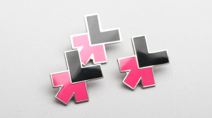
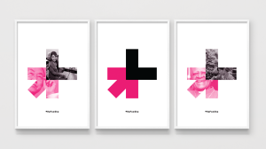
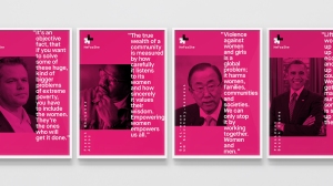
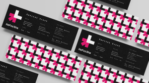
5. There Was A Lot of Thought Behind the Design. The look of HeForShe is very distinct, and after some research, I found that the design of the campaign was purposeful and distinct. In my post about the strategic design of HeForShe, I go into detail of how the HeForShe logo came to be, and that process shows how thoughtful the whole campaign is. I appreciate it because I am a design nerd, but I think others will appreciate how all-encompassing the campaign is.
6. There Are Tangible Efforts Being Made. Like how I mentioned in my slacktivism post (and my first takeaway in this post), some people believe that HeForShe is just another case of slacktivism where people will tweet their support, but do nothing else other than that. But, very recently, some huge strides have been made that work toward HeForShe’s goal of gender equality. In my post about the goals of HeForShe being tangible, I lay out specific examples of these strides. From more men stepping up to promote gender equality, to state policies being enacted, a difference is being made all over the world.
Thank you so much for following me through my journey of looking closely at the HeForShe campaign. I learned a lot through the process, and I hope that everyone who followed along learned just as much! I am hoping to continue this blog with other insights and discoveries that spark my interest. From movies, to television and books, and most likely any more information I find on HeForShe, I am making it a goal to keep this blog going!
Thanks again for reading, and stay tuned for more posts soon! 🙂
